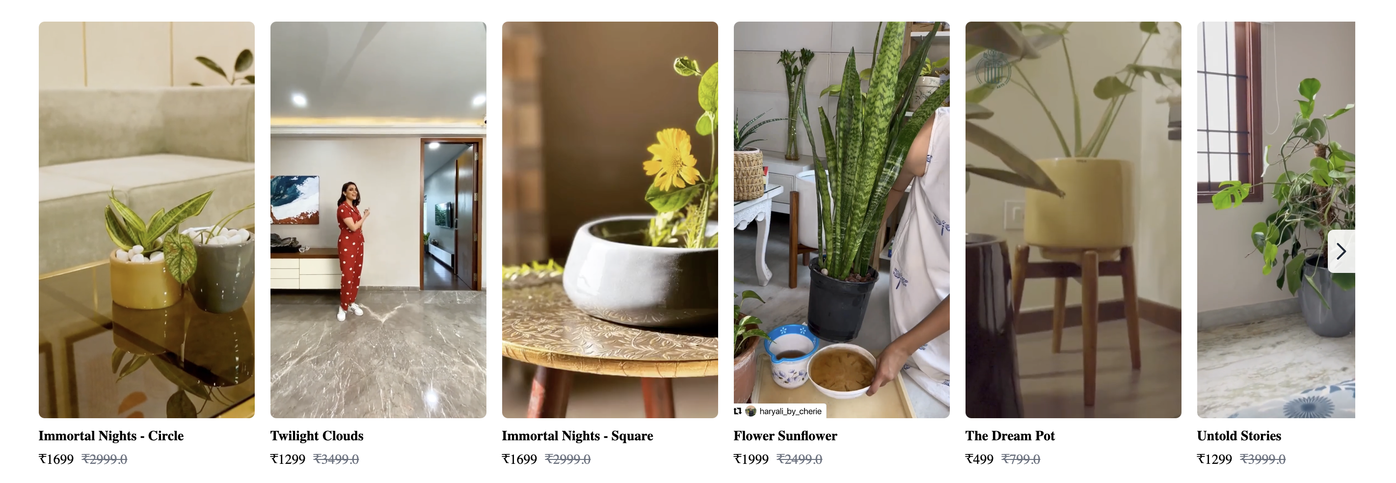
How to customize the Slider Widget?
How to Change the Look of Your Slider
Step 1: Click the Customize Design Button
Width and Height
You can set how wide and tall your video or widgets is by using the width and height settings. This helps you make sure everything fits nicely in your design.
Aligning Tagged Content
You can choose where to place your content in the layout. You can align it to the center or to the left. This helps you decide how everything looks together.
Example of Center Alignment

Example of Left Alignment

Remove Shadow of Video Card
The “Remove Video Card Shadow” toggle allows users to control the visibility of the shadow effect on video cards. This option is presented as a toggle switch with two possible states: “Yes” and “No”.
-
Yes: When toggled to “Yes”, the shadow effect on video cards will be hidden, giving a sleek and modern look.
-
No: When toggled to “No”, the shadow effect will be displayed as normal, providing depth and contrast to your video cards.
Auto Loop Slider
The “Auto Loop Slider” setting lets you turn on or off the slider that plays by itself. When it’s on, the slider will continuously display the pictures or videos in a loop without any manual intervention. This feature is ideal for showcasing a series of images or videos seamlessly and efficiently.
Video Card Preview
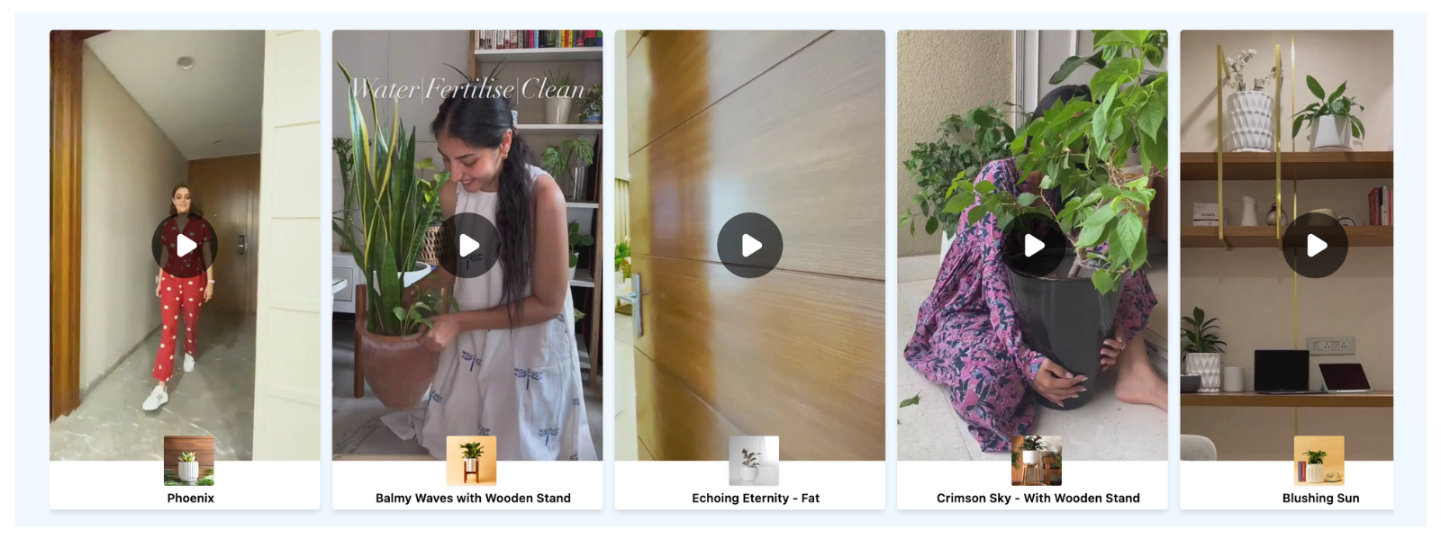
The “Video Card Preview” setting lets you choose how your video cards will show up. You have three super cool options to pick from!
Options:
-
Play Video in a Loop
- If you choose this, the video will keep playing over and over again as soon as you can see it. This is great for making sure everyone can see it!
-
Play When You Hover
- If you pick this option, the video will only play when you move your mouse over the video card. This makes it fun because you can see a preview just by hovering!
-
Show an Image
- This option shows a still picture instead of playing the video. The picture acts like a cover for the video. This is good if you want to save some resources or just want a simple look.
Add to Cart on Video Cards
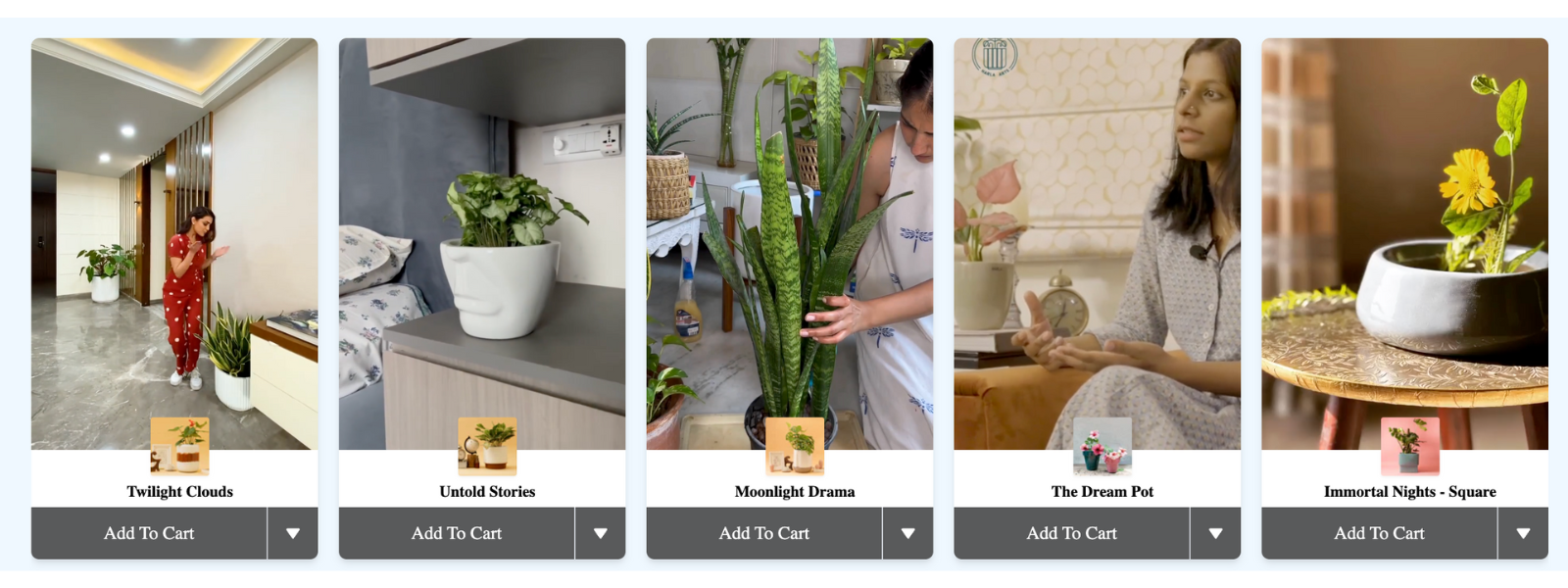
The “Add to Cart on Video Cards” setting allows you to control the visibility of the “Add to Cart” button on your video cards. This feature helps streamline the purchasing process for your customers.
Options:
-
Yes: When enabled, the “Add to Cart” button will be displayed directly on the video cards, allowing customers to quickly add items to their cart without additional navigation.
-
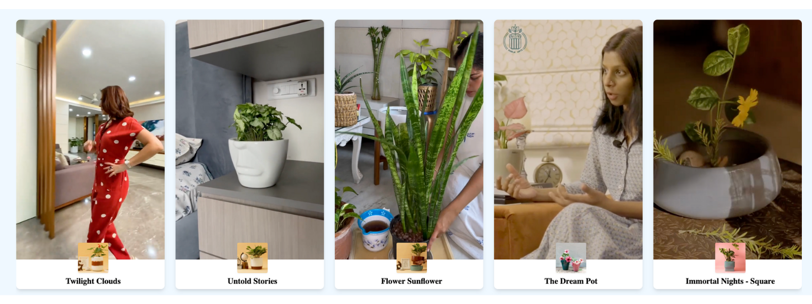
No: When disabled, the “Add to Cart” button will be hidden from the video cards, creating a cleaner, more minimalist appearance.
Tagged Product Design
The “Tagged Product Design” setting lets you choose how your tagged products will appear in video cards. You have three great options to pick from!
Options:
-
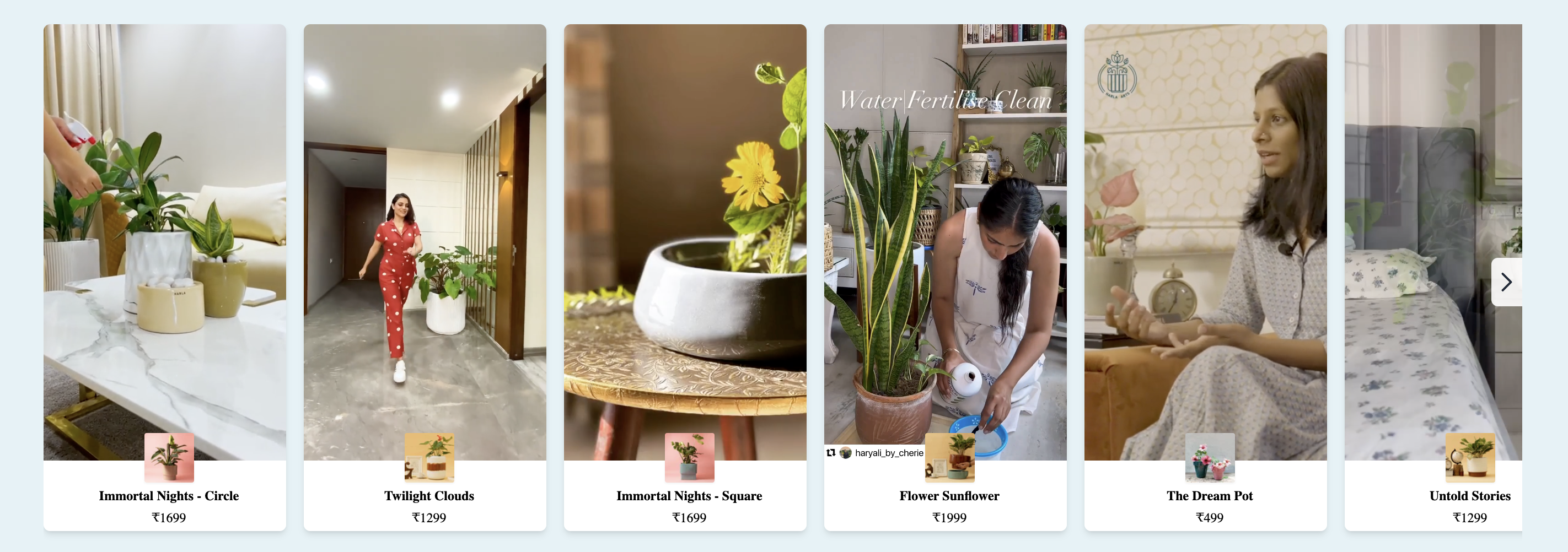
Card
- The “Card” Design features a clean white background with a vertically stacked layout showcasing the product image, title, and price. It supports customizable alignment (left or center) and click interactions for seamless user engagement.
-
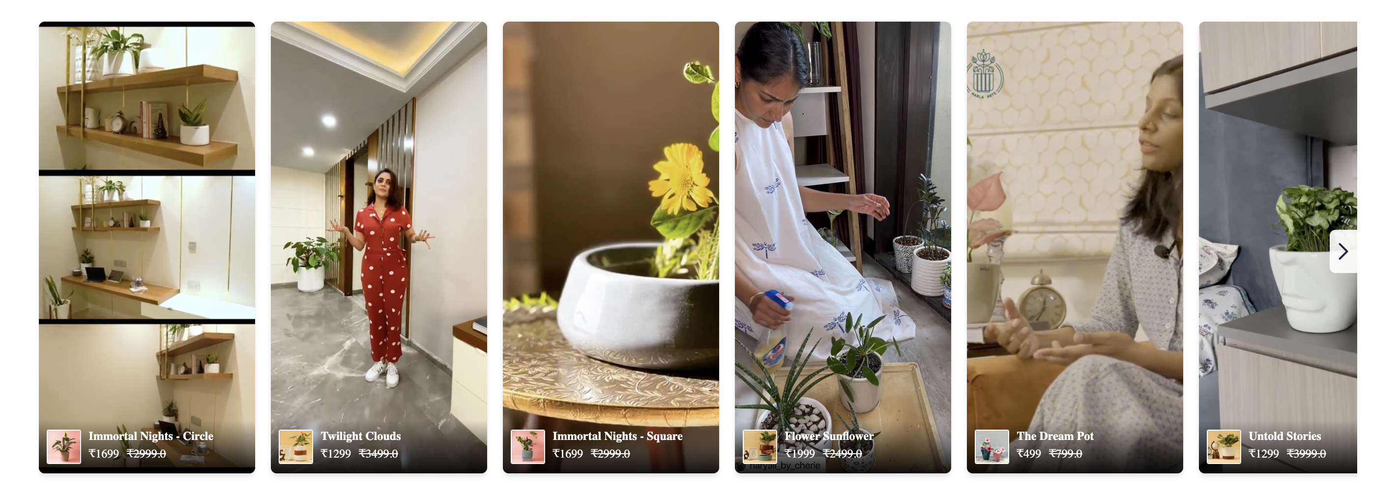
Overlay
- The “Overlay” Design displays a sleek black gradient overlay at the bottom of the video card, showcasing the product image, title, and price. It supports click interactions, providing a modern and engaging user experience.
-
Minimalist
- The “Minimalist” Design features a clean, minimal layout with the product title and price aligned vertically. It uses a light text theme and supports click interactions for easy user engagement.
